By: Lynn Barker
Tying in with the release of Monsters University on Blu-ray and DVD October 29th, the Disney folks gathered reporters together at the multi-Oscar-winning Pixar Animation Studios in Emeryville (across the bay from San Francisco), Ca. We toured, saw cool artwork and even played our own live version of the movie’s “Scare Games” (we came in 2nd BTW!).
 Monsters University versions of Sulley and Mike greet Pixar visitorsCourtesy of Lynn Barker
We came to the conclusion that the Pixar staff members have way too much fun at work but they work incredibly hard as well and have learned to function as a unit; a team determined to put egos aside to create the best animated films they can. It’s working and they have a case of Oscars, Golden Globes and other film awards in their lobby to prove it.
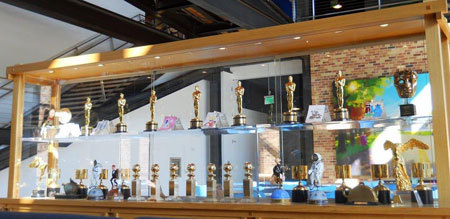 Awards case in Pixar lobbyCourtesy of Lynn Barker
Teamwork is the lesson learned by younger Mike and Sulley when they go to college and discover, as Monsters University director Dan Scanlon says, that you must “look past who you thought you were going to be in order to discover who you CAN be. Failures might lead to a new path and a new hope”.
The Road to Pixar
We sat down with some talented artists who had just such an experience on their road to Pixar. Let’s get some Career Counseling with Dice Tsutsumi, Lighting Art Director, Jae Hyung Kim, Animator and John Nevarez, Sketch Artist. These guys couldn’t have more different paths to Pixar and have some great advice for you!
 L to R John Nevarez, Dice Tsutsumi and Jae KimCourtesy of Disney/Pixar
John tells us that he mostly designs the sets for Pixar films. He grew up in East L.A. and pursued Math as a major but it really wasn’t his thing. He flunked out of college and was devastated. He took art classes and realized he was really good at that. He went back and graduated with an art degree and seeing Disney’s The Lion King really inspired him to make a career of his art. He got at least 25 rejection letters when trying to get hired but stuck with it until he worked at Disney TV Animation and Disney Toons and finally was hired at Pixar.
Born in Japan, Dice Tsutsumi, an Art Director, wanted to be a professional baseball player. He wasn’t that good at it and, feeling “lost”, came to the U.S. and took art classes because he thought it was an easy credit and he didn’t have to speak English! He was encouraged by kind older students who told him he had talent. Later, he learned that they told everybody that! But, he was inspired and went for it. He studied painting and ended up at Lucas Learning video games and Blue Sky Studios in New York working on Ice Age. He was invited to join the artists at Pixar.
 We become a Monsters University student in the Pixar lobbyCourtesy of Lynn Barker
Jae, an Animator, is from South Korea and was a medical doctor there but his heart wasn’t in it. He searched for something he’d love to do. His mom and aunt really loved art. Artwork was all around him. He came to the states to become an animator and worked his way to Pixar.
These guys were all inspired by the animated films Iron Giant, all the Miyazaki animated films from Japan like Spirited Away and Howl’s Moving Castle and watched the classic hand drawn Disney films as well. All think you have to have a great story to build upon to make any movie a success.
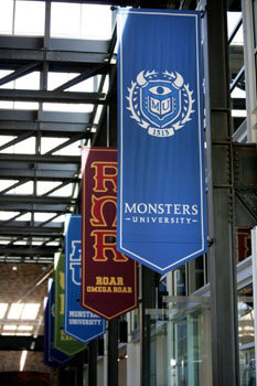 MU banners in Pixar lobbyCourtesy of Disney/Pixar
Other paths to Pixar included award winning artists who used to be bankers, policemen, military men, gardeners, etc. If you are interested in any phase of animation, the guys advise you to draw, watch a lot of movies and learn how to tell a good story. It’s about emotion and connecting with people and you should stay hungry. You have to want it! You also must be okay if you fail. Dice says “Failure is the best recipe for growth. You don’t grow out of success. You might gain confidence but you won’t get better”. Learn from your mistakes.
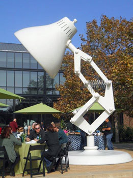 The Pixar Logo: a giant desk lamp
Building the Story
Expanding on the idea that a good story is at the core of all Pixar films, we met with Story Supervisor Kelsey Mann who taught us how to draw “Little Mike” while explaining that an empty page in front of you is intimidating to both artists and writers. Early on in the movie-making process ten to twelve story artists meet to hash out ideas. They put the ideas on a Sequence Board. As the story forms, bullet points listing each scene and how they fit together are put on note cards and a structure forms.
 Kelsey Mann draws a storyboardCourtesy of Disney/Pixar
It is so funny that, in their story meetings, when they go dry on ideas, the artists draw doodles of each other! We see some really cute ones on the wall. The animated scripts look like regular live action scripts with dialogue and action and artists’ doodles in the margins just like those you probably have drawn on your notebooks at school!
 Story Supervisor Kelsey Mann talks with reportersCourtesy of Disney/Pixar
For Monsters University the story artist guys and gals came up with funny college pranks and gags. All the artists create rough storyboards in the beginning that draw out the scenes then those are shot in Story Reels. The team uses digital drawing pads and use a program Pixar invented called Pitch Doctor combined with Photoshop.
Pitching a scene – Some animators need to be actors as well! As they show their drawings of each scene to other story artists and finally to Pixar head John Lasseter himself, they use dialogue and even make their own sound effects to win over the other artists to the scene they’ve created. After all the pitches, the gang gives notes for improvement to everybody so you can’t have an iron ego. When the Monsters University story changed, over 227,000 drawings had to be tossed as the group started over!
 Pixar filmmakers meet to talk their next movieCourtesy of Disney/Pixar
Monthropology 101
Monsters University has more characters in it than any other Pixar movie. Ricky Nierva, Production Designer and Jason Deamer, Character Art Director tell us they both designed the original Monsters Inc. movie that was on screens in 2000. The biggest challenge back then was animating Sulley’s colorful fur and cloth. It was hard! Now it’s easy and the challenge for Monsters University was the sheer number of characters to create. Hey, there are a ton of students and teachers in a big college.
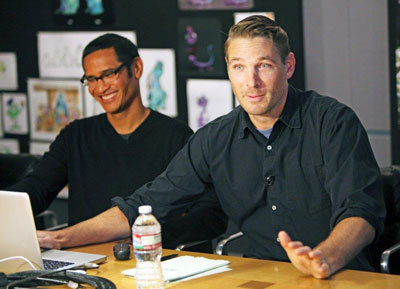 L to R Ricky Nierva and Jason Deamer talk charactersCourtesy of Disney/Pixar
Designing clothes, like fraternity jackets and initiation robes and putting them on furry, or slimy monsters was still a challenge. “How do you put a robe on a character whose arms come out between his legs?” We are shown some very funny attempts.
We see walls of various background character types based upon just a few basic shapes to equal the 500 characters needed. These shapes and colors could be altered to create different students etc. Wings and horns were added to make each one different. The team made 45 monsters out of each body type. A few characters were “one-offs” and different from the rest. To keep all their background characters straight they named each one after a worker at Pixar!
Bring on the animals! - In addition to the student and teacher monsters, there were various animals in the movie. They had to look different than the monsters in order to be recognized as pets or mascots. The ROR fraternity mascot Pig went through many designs in order to look more animal-like and less like a monster college freshman! We are shown hilarious attempts at designing and see pictures of director Dan Scanlon’s wall-eyed pet dog Carol who served as the pet pig model. Goat eyes and horns were added and voila! The Scare Pig!
 Monsters University Director Dan ScanlonCourtesy of Disney/Pixar
Bring on the girls! - For Monsters Inc. a few lead female characters were created but for Monsters University, the team brought on the girls! Dean Hardscrabble (voiced by accomplished actress Helen Mirren) was a male in early drawings but evolved into a very strong woman.. with a centipede body and wings. There were also Sporty and Goth college sorority groups in the film as well as a librarian and sorority girl Claire.
 Famous Apple founder Steve Jobs' building at PixarCourtesy of Disney/Pixar
When you get the DVD/Blu-ray, Ricky and Jason advise you to freeze frame and check out all the very funny background characters as Mike walks across campus. We did so and were laughing and delighted at what we might have missed without a closer look.
Did the filmmakers design any monsters that were rejected? Yep! “Some of the librarian drawings were just too scary. There was a giant maggot version of the librarian. It would eat a monster and spit it out. It had giant teeth. It was just too much!”
 Monsters University Gate at PixarCourtesy of Lynn Barker
Come back very soon for Part 2 of our trip to Pixar for Monsters University and be sure to check out the Blu-ray and DVD in stores Tuesday, Oct. 29th!


